RGB - what is worth knowing?
Contents:
RGB - what is worth knowing?
The spectrum of electromagnetic waves in the range from 380 to 780 nanometers has many mathematical descriptions in the form of a three-dimensional color space. This is important because the human eye is at work here. In the case of creating colors on screens and monitors, the RGB system is used.
What is an RGB model?
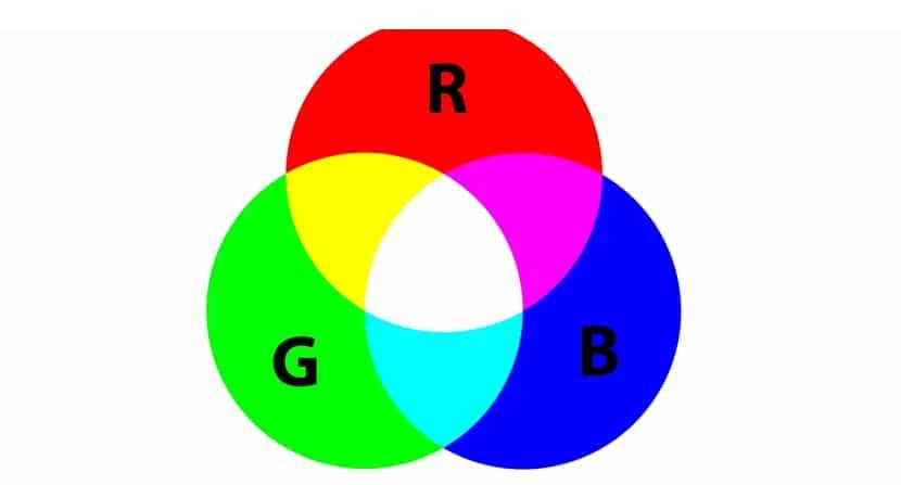
RGB - one of the main color space models related to visible light, thanks to which colors can be recorded on all types of light-emitting devices.
The name itself is an abbreviation of the first letters of the three colors in English:
- R red means red
- G - green, i.e. green
- B - blue, which means blue
The system is the result of the direct perception of color by the human eye. The fact is that all the colors perceived by the eye can be correctly represented as a result of mixing light fluxes in the right proportions in these three colors. The RGB recording method is primarily applied to modern projection devices, i.e. monitors, LCD screens, smartphone and tablet screens, and projectors. It also works well for detection devices such as digital cameras and scanners, as well as in computer science, since the color palette of most files is written in RGB as a 24-bit notation - 8 bits for each component.
How are colors reproduced in the RGB system?
To obtain component colors in RGB, an additive synthesis method is used, which consists in creating individual colors by mixing light rays with carefully selected intensities. As a result, multi-colored images appear on monitors or other devices mentioned above. In other words, when the light rays of the three primary colors fall on the surface of the screen, they automatically create new colors that are captured by the human eye, superimposed on each other. This is due to the specific properties of the eye, which is not able to distinguish between individual components, but sees them together, simply as a new color. The rays of light from the screen go straight into the eyes and are not reflected from anything along the way.
The addition of additional components in additive synthesis occurs on a black background, because this is the case with monitors. This is quite different than in the case of the CMYK color palette, in which the background is the white color of the sheet and it is applied to it by overlaying the components using the halftone method. The RGB model provides a lot of possibilities, but remember that the devices used are of key importance for color reproduction. Each of them can have different spectral characteristics and therefore differences in color perception depending on which screen the eyes are on.
How to get a specific color?
It is worth emphasizing that each color in the RGB system can have any value from 0 to 255, i.e. display brightness of certain colors. When the component is set to 0, the screen will not be able to glow in that color. The value 255 is the maximum possible brightness. To get yellow, R and G must be 255 and B must be 0.
To get white light in RGB, opposite colors must be mixed at maximum intensity, i.e. the colors on opposite sides - R, G and B should therefore have a value of 255. Black is obtained at the smallest values, i.e. 0. Z, in turn, gray color requires assigning to each component a value in the middle of this scale, i.e. 128. Thus, by mixing output color values, any color can be reflected.
Why are red, green and blue colors used?
This topic has already been partially discussed. After all, it is no coincidence that these three colors are used in this model, and not any others. Everything rests on the specific capabilities of the human eye. It contains special photoreceptors of vision, consisting of retinal neurons. In the context of these considerations, the cones responsible for photopic vision, i.e., the perception of color in good light, are of particular importance. If the light is too intense, the sensitivity of vision deteriorates due to the high saturation of these neurons with it.
Thus, suppositories absorb light having different wavelength ranges, and it so happens that there are three main groups of suppositories - each of them shows a special sensitivity to a very specific wavelength. As a result, wavelengths around 700 nm are responsible for seeing red, around 530 nm give the impression of blue in perception, and wavelengths of 420 nm give green. The rich color palette is the result of the reaction of individual groups of suppositories to visible wavelengths of light.
If light enters directly into the organ of vision and is not reflected on any object in its path, then certain colors can be relatively easily reflected, which happens on monitors, screens, projectors or cameras. The additive function mentioned above is used, which consists in adding individual colors to a dark background. It is quite another thing when the human eye sees reflected light. In such a situation, the perception of color becomes the result of the absorption of electromagnetic waves of a certain length by the object. In the human brain, this leads to the appearance of a certain color. This is the exact opposite of the additive principle, where colors are subtracted from a white background.
How is the RGB color palette used?
RGB is of key importance in the context of activities related to the field of Internet marketing. First of all, we are talking about creating a website design project and all other activities on the Internet related to adding photos and images to published content (for example, on social networks), as well as creating graphics or infographics. Without proper knowledge of creating colors in the RGB model, it would be difficult to achieve completely satisfactory effects, especially since each graphic looks slightly different on individual electronic devices. Even a simple change in the brightness of the screen causes a different perception of colors (which is due to the sensitivity of the cones).
It is worth remembering that monitor settings affect the perception of colors and hence sometimes really big differences in shades. This knowledge certainly avoids many misunderstandings along the line of graphics and clients. That is why it is so important to see a specific project on at least several monitors. Then it is easier to understand what the audience sees. There will also be no problem that, after approval, the project will present itself differently, because the client suddenly changed the monitor settings.
One way out of the situation is to work with a graphic designer who has a quality device that allows you to best display colors in terms of output parameters. At the same time, it should be emphasized that in the case of printed products, such problems do not arise. It is enough to prepare a test print in advance to see how the entire print run will actually look like.
Source:
Producer of outdoor advertising – https://anyshape.pl/
Leave a Reply